
|
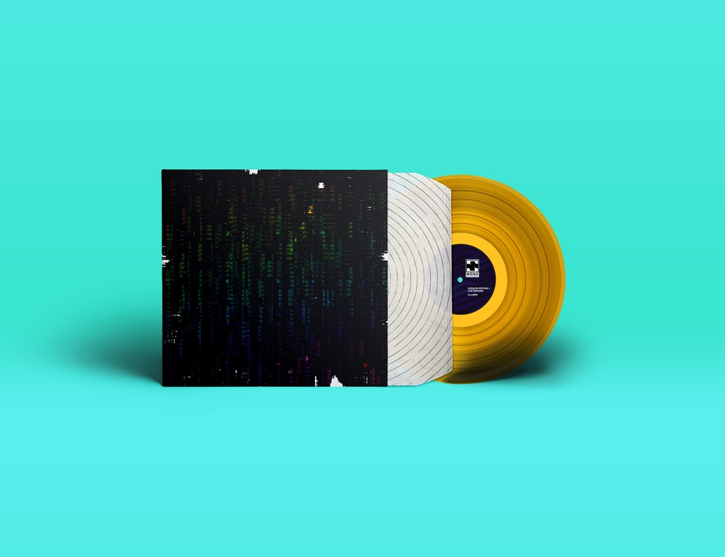
5/23/2017 0 Comments EvaluationFor this last module of our second years we were asked to do two briefs, one being a week long personal brief that was all about yourself and giving us the ability to express our style as well as help answer questions that some of us might not have really thought about before. The second brief was up to us, for this second, I decided to create a record label that was responsible for Lossless Festival (My response the festival brief during L4).
Starting my manifesto I was unsure on how I wanted the visual style to be, I ended up using a skill I discovered from the last project (shading with grain) and well as using the colour red (something I consider as part of my style) to create small illustrations. With strong bold shapes and well as using a monochromatic colour range of White, Black and Red, a strong contrast was created and allowed everything to stand out. In places I illustrated answers with deeper meanings such as the flying pig, this portrays being able to achieve anything if you put your mind to it. Overall I really enjoyed both briefs, surprisingly I enjoyed the manifesto brief a lot more than I expected as upon getting the brief just before the break I wasn't overly keep on the idea, but after putting some thought into in and started creating I was hooked! the more I got into it the more I realized I had a passion for illustration as well as graphic design, personally I don't feel confident with my fundamentals in drawing but still felt extremely happy with my outcome and this has pushed me to improve my all-round drawing skills as I will defiantly be taking this new passion further into the future. I also enjoyed my self-directed as I seem to really be into music related projects as music is a big part of my life outside university. This time though I found this much harder that in L4, I assumed creating album covers wouldn't been too much different to making a central graphic for something such as a poster, I was wrong. I did struggle to come up with anything that I found visually appealing as well and expressing the music that the covers where associated with, after a lot of head scratching and creative black I ended up creating 4 that I am really happy with. I defiantly learnt from this experience and will take this new knowledge into my next assignments in the following academic year. One think I still need to massively work on for L6 is my time management skills and self-discipline, although I’m positive next year I will have turned my laxed attitude to education around and this is when it really counts. Anything I need to work on is getting excited and into a project as soon as I receive a brief, this will help me grow my idea’s more before I start creating. I think this is mainly important as I tend to waste a lot of time correcting previously made mistakes that could have been easily avoided if I spent more time on the planning stage, this also is part of time management.
0 Comments
5/23/2017 0 Comments MONO
Mono /Single
When creating this logo I looked into wave forms and the concept of mono, although used in the beginning of many words the general meaning is single/one way/first. As you can see from the picture above, the logo is based from an M I created, I chose to half it the reflect the shape of a sound wave as well as taking inspiration from the mono electrical symbol. This logo has been created with scale-ability in mind, with a strong bold shape this logo can be scaled down very small whilst still maintaining it's clarity, allowing it to be printed from something as small as on the record label to large billboard posters. As well as thinking about the clarity I also wanted the logo to be a strong recognizable mark, in this case I think simple is better. 5/23/2017 0 Comments Manifesto of me *****Our first brief was to create a 9 page, concertina style booklet in a vertical orientation. the contents of this concertina will consist of 9 personal questions that allow us to express our personality. the visual style for this brief was also completely down to us, allowing everyone to show their own style.
5/11/2017 0 Comments Captured TracksCaptured Tracks are one of my favorite record labels current for their great taste in music and visual style. A true independent label they're always looking to push their artists and label to new area's to aid creativity. http://www.capturedtracks.com/ using their site I gathered a lot of inspiration, this was one of the first places I look on decided to create a record label for this brief. 5/9/2017 0 Comments Final manifesto
|
Search by typing & pressing enter


 RSS Feed
